Key Takeaways
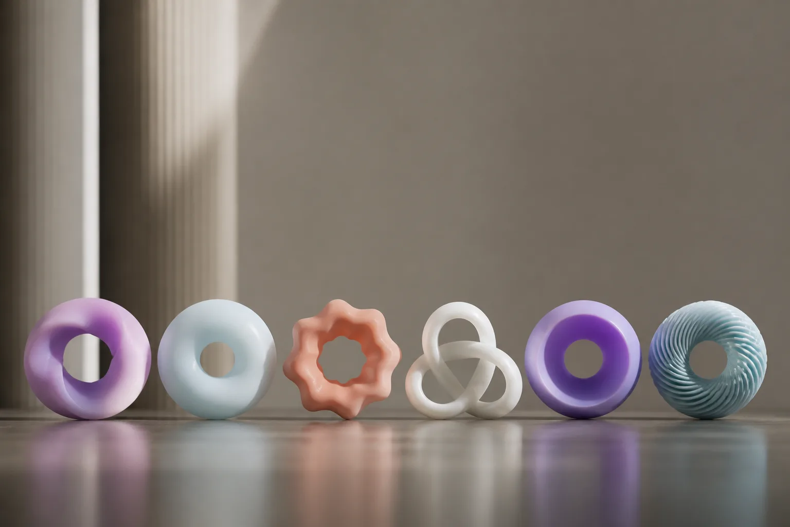
- A source essay argues that many AI logos share a common visual pattern: circular forms, gradients, and a central opening or focal point.
- The piece suggests the resemblance is driven less by intent than by familiar design choices, corporate consensus, and imitation across the industry.
- Beyond the joke, the article frames the trend as evidence of how quickly tech branding can converge around one “safe” visual language.
What happened
A playful source article takes aim at a real branding pattern: a growing number of AI company logos use circular shapes, soft curves, gradients, and center-focused compositions. The piece argues that, once you notice this recurring formula, many AI marks begin to feel visually similar in a way that is hard to unsee.
The article points to OpenAI as a prominent example. It describes the company’s current logo as a circular mark with a subtle gradient and a central void, and contrasts it with the company’s earlier text-based branding. The source also quotes OpenAI’s own design language around the logo, then treats that explanation as corporate euphemism for a simple visual decision: make it feel polished, modern, and approachable.
From there, the article broadens the argument to the “big AI companies” more generally. It says many of their logos lean toward circular or snowflake-like forms with central openings. It notes two exceptions, DeepSeek and Midjourney, which the author says do not follow the same visual pattern.
The source claims Anthropic’s Claude logo makes the comparison especially obvious, though it presents that as a humorous visual read rather than a formal design critique. It also says the pattern is not limited to AI companies, but argues that the concentration is noticeably higher in the AI sector than elsewhere.
The article references Fast Company as having noticed the trend in 2023 and having described it in less anatomical terms. That earlier coverage is used to support the idea that this is not a one-off observation, but a branding pattern that has already been visible enough to attract outside commentary.
Why it matters
The source is joking, but it is also pointing to something recognizable in technology branding: when a category is new and competitive, companies often converge on the same visual cues to signal legitimacy.
In the article’s view, circles imply wholeness, completion, and infinity, which makes them attractive to companies that want to project calm, confidence, and broad capability. That matters in AI, where the public image of the technology is often mixed. A soft, polished logo can help make a product seem less intimidating, more “human-centered,” and more mature.
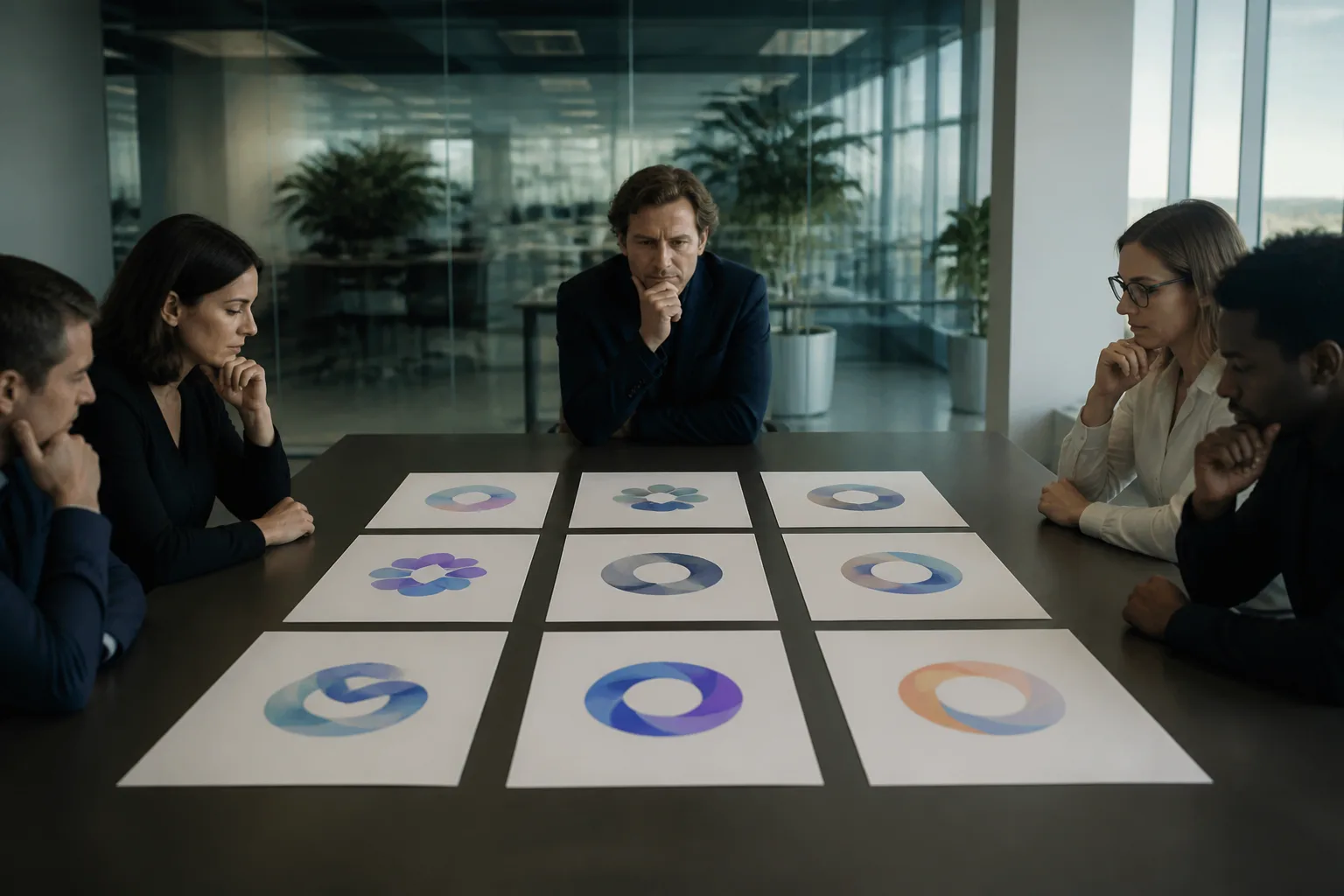
The source also argues that this convergence may be partly accidental. It points to pareidolia, the human tendency to see familiar forms in random or ambiguous shapes. In other words, part of the joke is in the eye of the beholder. A circular logo with a center point may be intended as modern and abstract, but once someone spots an anatomical resemblance, it becomes difficult to ignore.
Another explanation the article offers is the copycat effect. If one major player settles on a particular visual style, others may follow because it reads as current and credible. In that sense, the source treats logo similarity as a symptom of industry pressure: brands want to look innovative, but they also want to look safe. The result is design that is technically distinct but visually interchangeable.
The article extends that point into a broader critique of tech branding. It argues that companies often say they are disrupting an industry while still borrowing the same aesthetics everyone else uses. That tension is not unique to AI, but the source suggests it is especially visible in AI because the sector is so crowded with visually similar brands trying to communicate sophistication at the same time.
What to watch
The source closes by suggesting that the next phase of AI branding could move away from circular, gradient-heavy marks if companies want to stand out. It offers alternatives such as sharper geometry, stronger use of negative space, less reliance on radial symmetry, and more distinctive color systems.
Whether that shift happens will likely depend on whether AI companies keep rewarding the same visual signals or begin treating differentiation as a competitive advantage. If the current look remains associated with “serious AI,” more startups may continue to adopt it, even if it makes the category feel visually repetitive.
A few broader signals are worth watching:
- Whether newer AI startups break from the circular, center-focused template.
- Whether established companies refresh their marks or keep leaning into the same soft, approachable forms.
- Whether design commentary like this becomes a more common reaction to branding in fast-moving tech categories.
For now, the source’s central argument is simple: AI branding has developed a recognizable house style, and that house style is unusual enough to invite jokes. Underneath the humor, though, is a straightforward observation about design convergence in a crowded market. Companies may be trying to look innovative, but many of them are ending up in the same visual place.